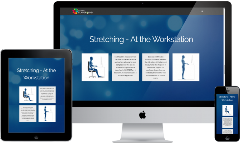
A few years ago, eLearning courses were generally built with desktop web browsers or large screens in mind. Smartphones and tablets were not available yet as such users had access to only computers and laptops, but this is now a thing of the past. Technology and the world now move on a fast lane; accessing of online resources are done on many different devices, and it has since been realized that mobile devices take a huge percentage of internet surfing. Designers and developers are forced to make the building of content targeted at this small and medium screens top priority without abandoning the traditional large screens; hence, the need for building responsive sites.

Responsive design refers to the building of websites and eLearning courses with contents that adapts and scales on all kinds of devices with different screen sizes and orientation. This involves using a mix of flexible layouts and grids, images, and buttons that respond to users’ behavior and interaction. Course designers are increasingly expected to use components that automatically resize to fit every user’s device, be it a laptop, tablet, smartphone, or any of the many other devices. This is because the invention of web-accessing devices is a work in progress and building different versions of websites and courses for every specific device is practically not feasible due to the huge number of devices on the list.

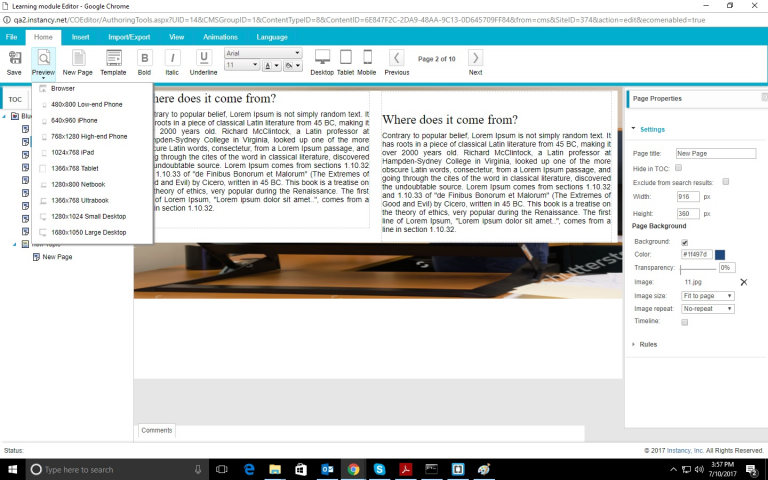
However, modern learners use a wide range of devices to access eLearning content that may not necessarily be the traditional laptops and PCs, therefore, prompting the need to build course layouts that fit these screens. Thus, multiplatform-friendly eLearning is the ideal solution. Online learners stand to benefit with such eLearning courses and get the information they need, whether they are viewing the courses from a smartphone, desktop, or tablet. Using authoring tools that automate producing responsive content, eLearning course designers ensure that the learners get the same experience while on the go on a smartphone as they get while viewing the course on their desktop computer. These tools use HTML5, which traditionally supports necessary elements like video, audio, and navigation used in the eLearning content design without requiring plugins. This drastically reduces the time taken to load pages on user’s devices. To ensure this entire tricky and seemly cumbersome job is done effectively and efficiently, using responsive design eLearning authoring tools is clearly needed, one of which is Instancy. Instancy’s cloud-based authoring suite of tools let you – as a designer – create content once and get it delivered in many formats to different devices, be it desktop web browsers, mobile devices, or prints without you writing a single line of code or creating multiple versions of the same content. One of the key features of Instancy authoring is the ability to import regular office files like MS PowerPoint and MS Word, converting them into eLearning contents, saving both time and cost. It also lets you develop assessment or quiz for course learners and even create and administer a survey to the user. To see how to create eLearning contents, you should sign-up for a free-trial of Instancy web authoring system to take a look at how easy it is to create responsive eLearning courses without any technical knowledge


